Sensory
Map App.
A mobile product concept that helps neurodivergent and sensory-sensitive adults navigate public spaces by prioritizing environmental predictability and sensory data.
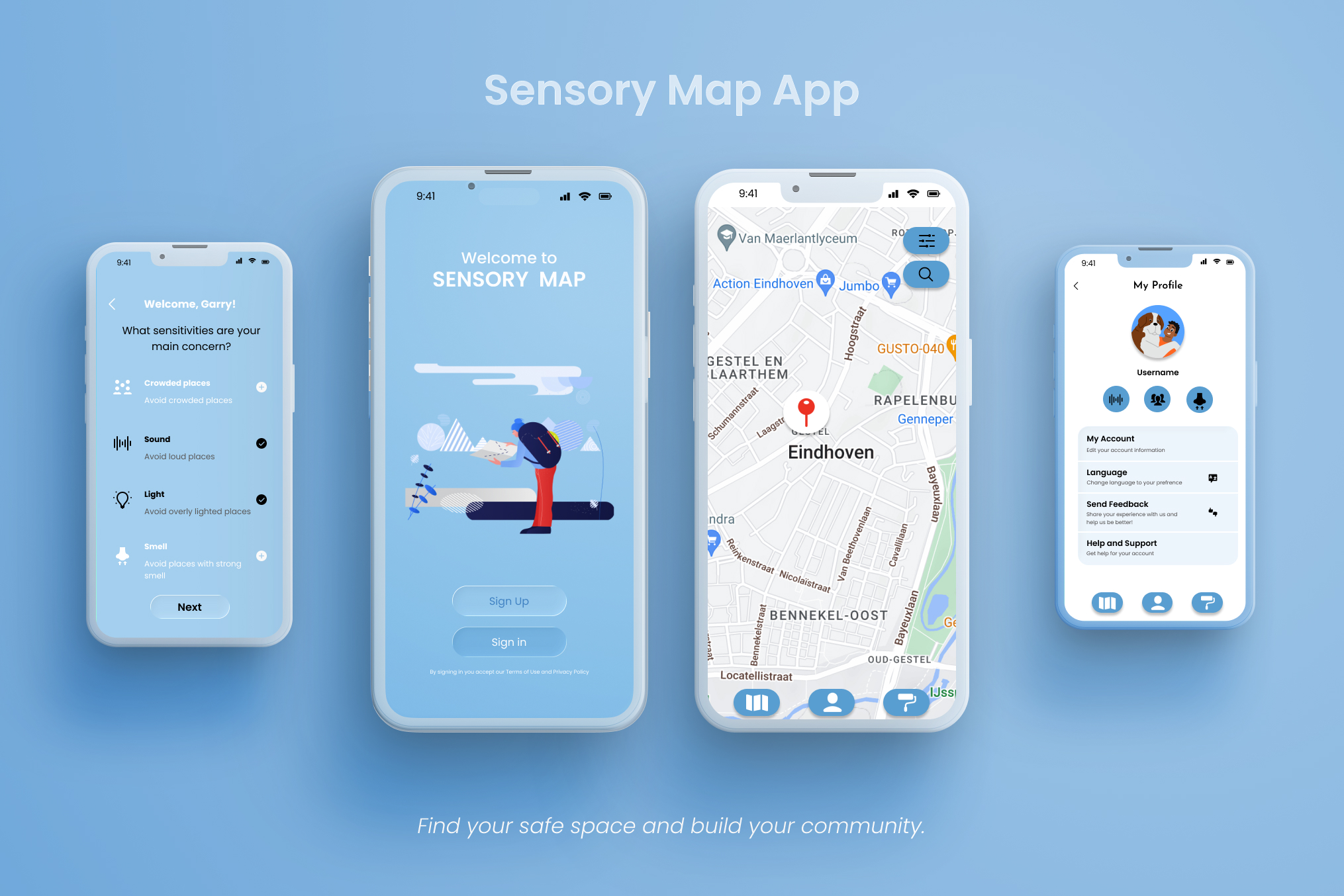
Map the sensory experience, not just the location.
Many neurodivergent individuals experience public spaces differently due to noise, lighting, and crowds. However, standard navigation tools focus entirely on distance and generic star ratings.
I designed a map interface that supports predictability and personal comfort by utilizing customizable sensory filters and crowdsourced environmental data.
Designing for predictability.
I conducted generative research to understand the daily challenges of sensory-sensitive adults, specifically focusing on environmental triggers in public spaces like unpredictable noise and harsh lighting.
Core Question
What if navigation apps showed how a place might feel before you arrive?
The Design Gap
Existing tools rarely support sensory predictability, leaving a massive accessibility gap in the market.
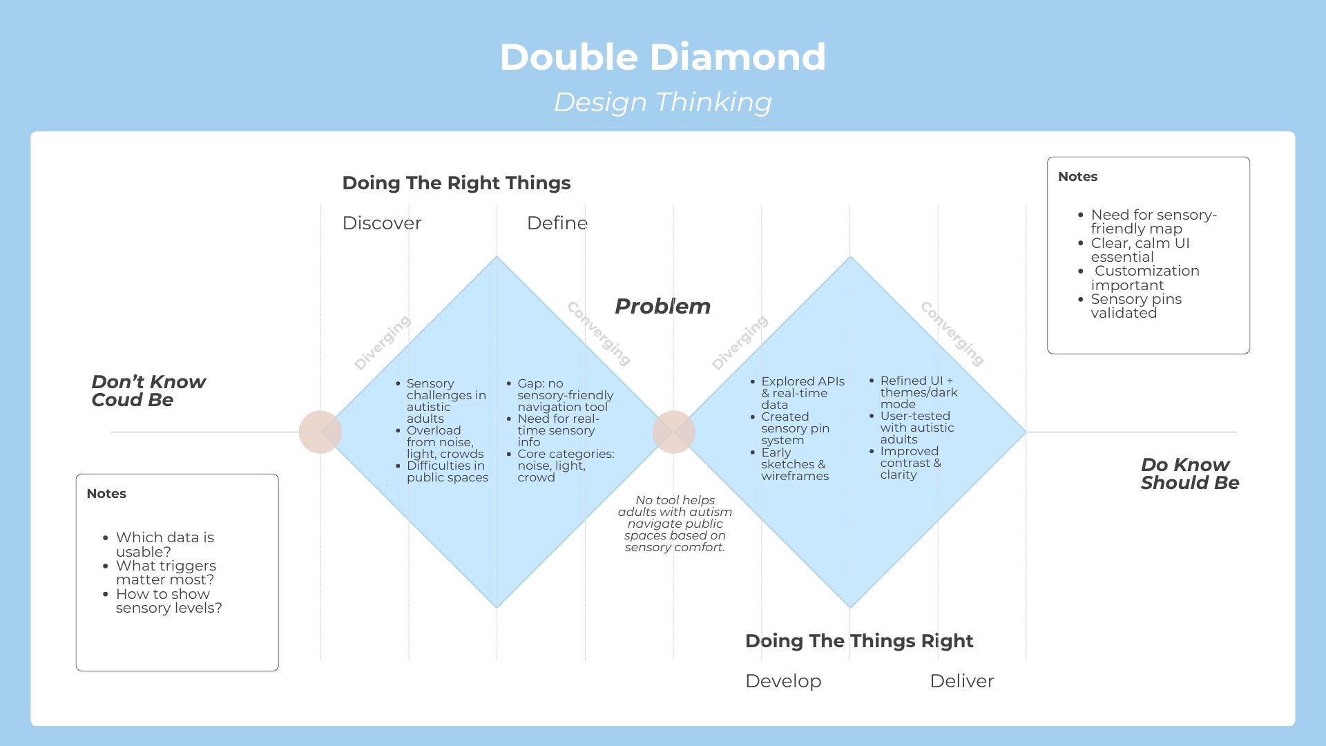
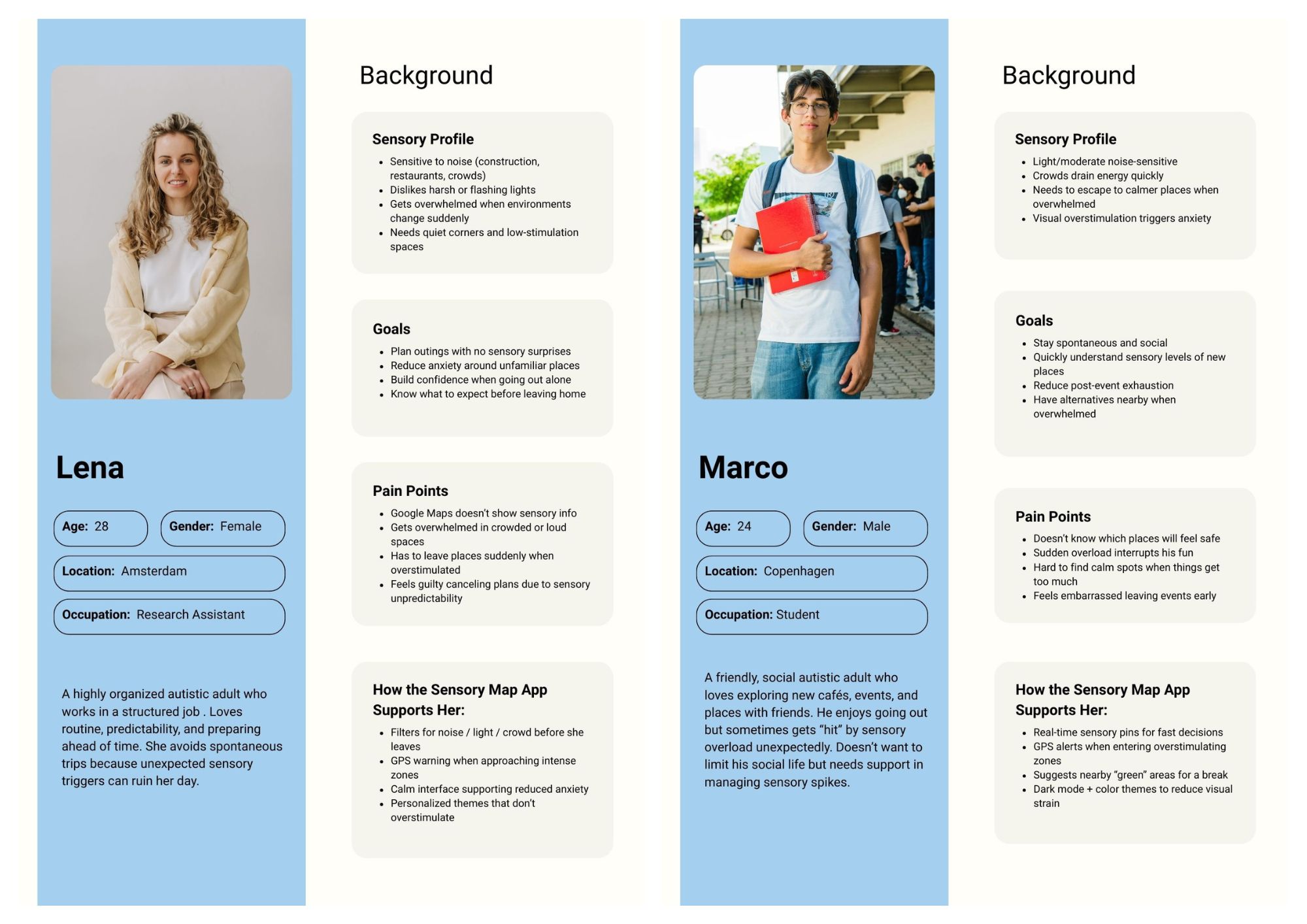
I synthesized user insights into behavioral archetypes focused on sensory triggers, coping strategies, and emotional states rather than standard demographics. Domain expert feedback reinforced the need for extensive customization, dark UI themes, and clear visual indicators.
Translating research into accessible UI patterns.
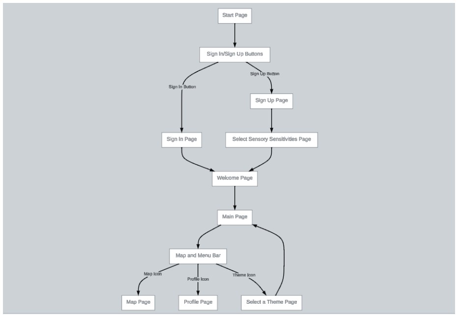
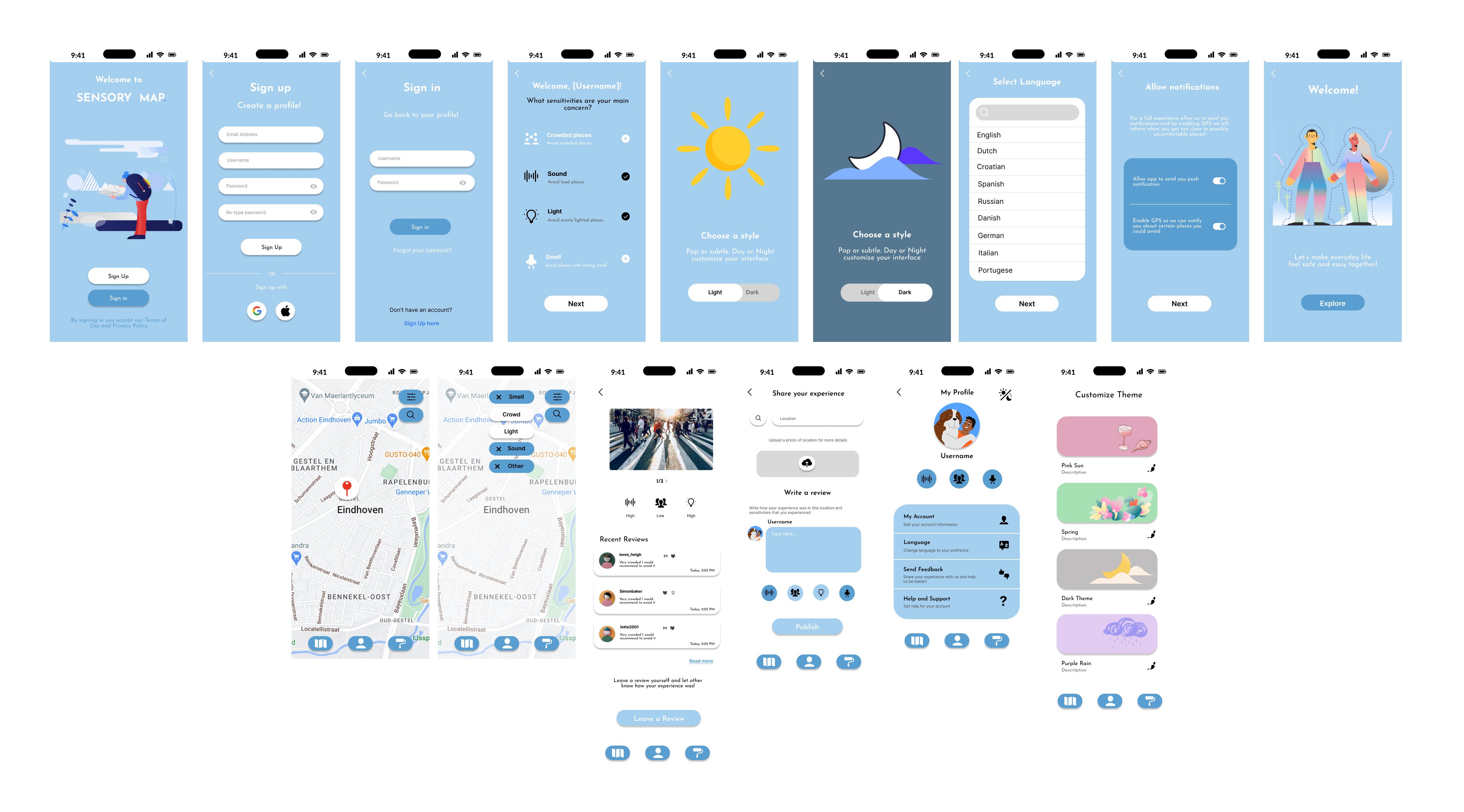
I translated user needs into a core feature set. The information architecture prioritized a highly predictable user journey with zero dead ends.
Map Pins
Visual indicators showing noise, light, and crowd intensity at a single glance without requiring extra taps.
Profiles
Customizable settings allowing users to define their own specific sensory sensitivities and comfort levels.
Alerts
Location-based notifications proactively warning users before they enter potentially overwhelming areas.
I explored multiple visual directions, ultimately selecting a low-stimulus palette that balanced visual calm with WCAG contrast requirements. The UI adhered to strict accessibility principles including clear hierarchy, explicit iconography, and zero disruptive animations.
Validating usability and emotional response.
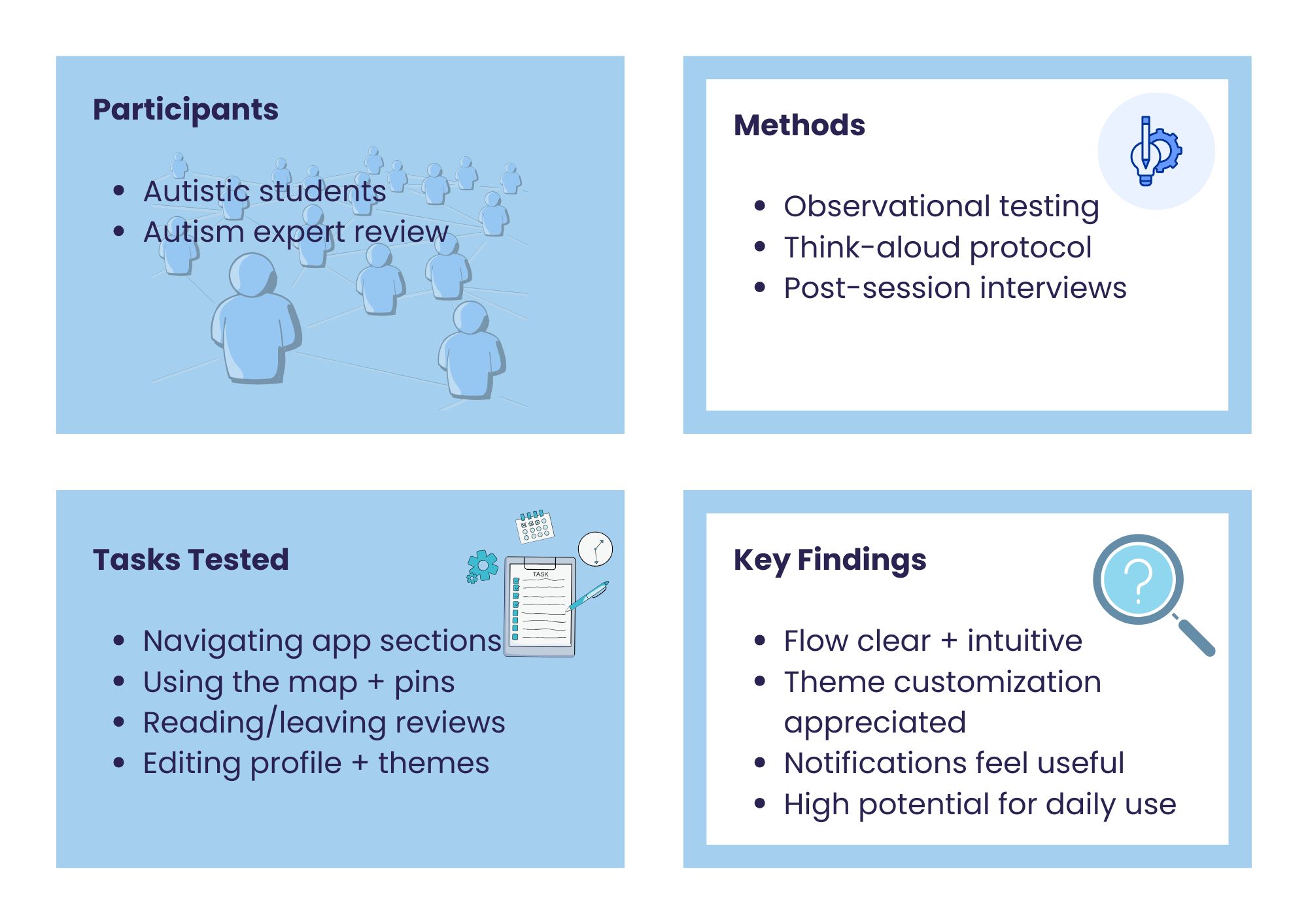
I conducted moderated usability sessions with neurodivergent users utilizing think-aloud protocols and semi-structured interviews. I also partnered with a domain expert to validate the overall product strategy.
- Users found the navigation architecture logical and highly predictable.
- Dark mode was validated not just as a preference, but as a critical accessibility requirement.
- Location-based notifications felt supportive and avoided cognitive overload.
- Research insights directly informed contrast adjustments in the final high-fidelity designs.
Bridging inclusive design and technical execution.
This product allowed me to translate complex behavioral research into actionable, inclusive UI patterns. By building a functional React prototype integrated with Map APIs, I successfully bridged the gap between UX strategy and frontend feasibility.
This project reinforced my approach to building accessible, research-led digital products that prioritize real user needs over generic features.