Otrium: Platform &
Conversion Optimization.
Reducing shopping friction through A/B testing, a simplified checkout flow, and cleaner design tokens, resulting in an annualized €1.3M GMV impact.
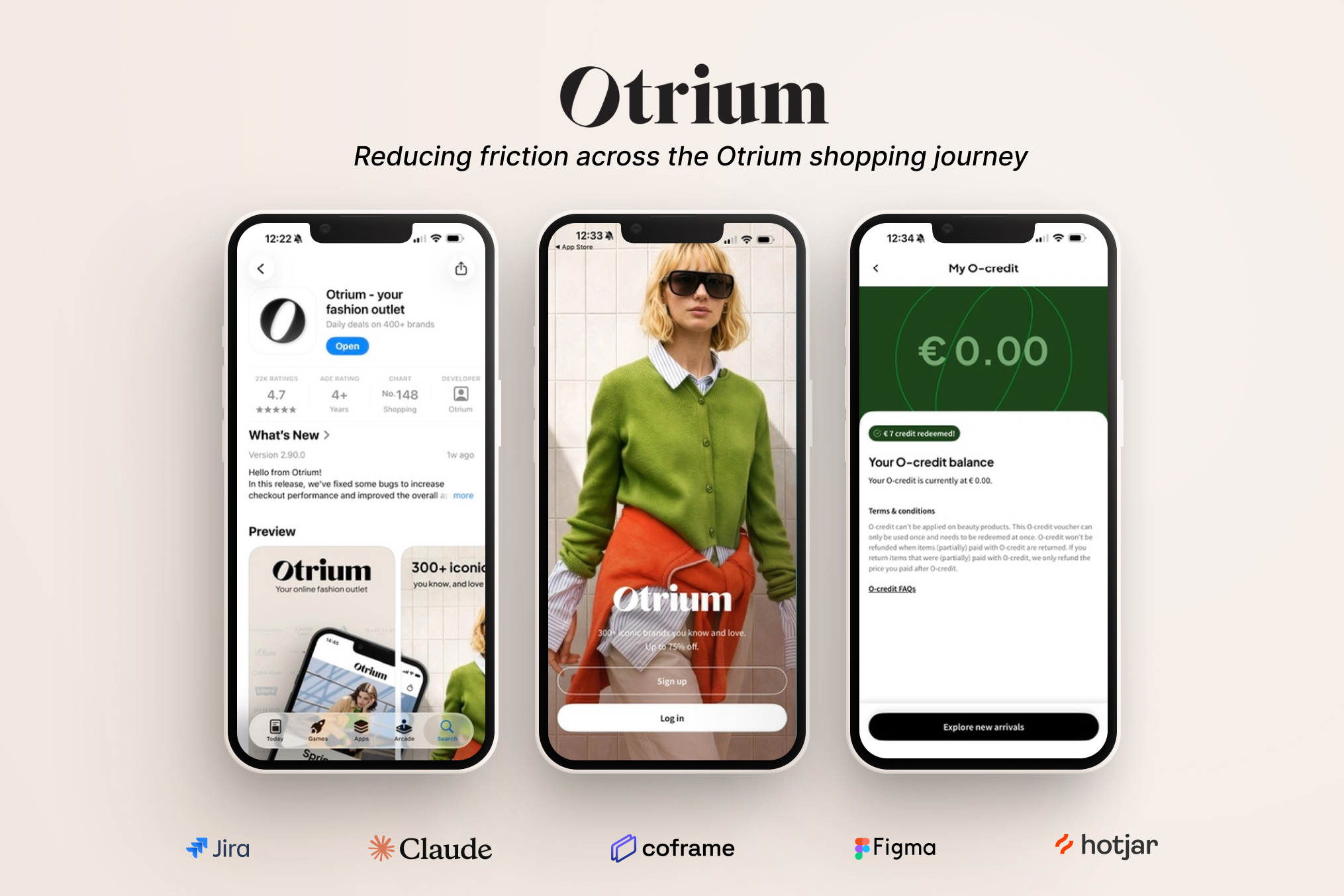
Research first, design second.
Otrium is an off-price fashion marketplace for excess inventory. My goal was straightforward: figure out where shoppers were dropping off, design targeted solutions, and validate them with real user data.
I focused on two main areas: improving product discovery on the homepage and designing Store Credit to encourage repeat purchases. I also updated core design tokens to clean up our UI components and improve developer handoff.
Fixing Homepage Drop-off
Heatmaps and session recordings revealed that shoppers were mostly ignoring promotional banners and going straight for the search bar. The homepage wasn't guiding them to discover new items effectively.
"A failed A/B test just tells you what the user actually needs."
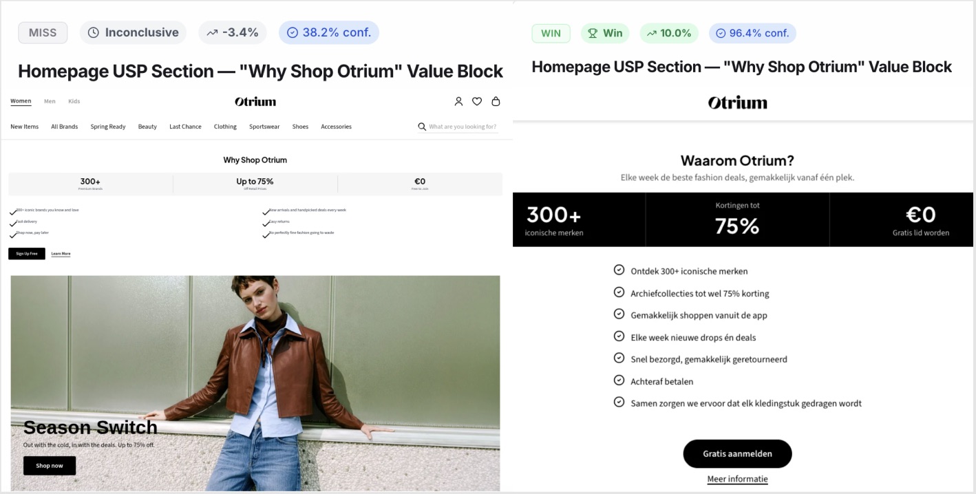
A perfect example of this was testing a new "Why Shop Otrium" block. As shown in the Coframe data below, the initial rollout actually caused a 3.4% drop in conversion. Instead of scrapping the design, I dug into the user experience to understand the friction. The issue wasn't the information; it was the timing and placement.
We were asking users to commit too early. By moving the block to the bottom of the page and adding clear Unique Selling Propositions (USPs) to actively build trust, we gave users the space to explore the platform first without feeling forced to sign up or log in. This empathetic shift in the user journey flipped the test from a -3.4% loss to a +10.0% conversion win.
I used Coframe to run similar tests across navigation, layout hierarchy, and microcopy. Here is a breakdown of the most impactful structural wins:
+14.9%
Layout Shift: Moving category links above promotional banners resulted in our biggest conversion win on the homepage.
+10.0%
Timing & Trust: Moving the USP block to the bottom of the page allowed users to explore first, turning an initial drop into a massive uplift.
+2.0%
Mobile UI: Validated that a simple 2-column grid performed much better than horizontal swipe carousels on mobile screens.
Building O-Credit
A lot of users would buy once and not return. To drive repeat purchases, I designed Otrium's store credit feature completely from scratch. This required deep competitor analysis, rapid wireframing, and tight collaboration across product, marketing, and engineering teams.
Working closely with marketing, who officially named the feature "O-Credit", I mapped out the entire end-to-end journey. I created a dedicated O-Credit hub within the "My Account" area, integrated its visibility into the global menu bar, and designed a fun, intuitive 1-click toggle to apply the cash value directly at checkout.
The Hypothesis
Presenting earned credit as a transparent, fun cash discount (-€10) with a 1-click toggle at checkout builds trust and motivates users to complete a second order.
The Live Result
A rolling A/B/C/D live test revealed a +150% conversion lift in second-order purchases for the €20 credit variant.
- Handling Edge Cases: Mapped out and designed the full UI for expired vouchers, partial balances, empty states, and API errors.
- Developer Handoff: Provided structured component states and documentation directly to the B2C engineering team.
- User Feedback: An early release to 281 shoppers resulted in a 4.6 out of 5 rating for ease of use.
Design Tokens & Navigation.
Running fast A/B tests can sometimes lead to an inconsistent UI. To prevent this, I audited and updated the design tokens in Otrium’s design system (Ozone) and created new global components.
"A fix made in the design system is a fix made everywhere."
- Token Architecture: Cleaned up the variables for border radii, elevation shadows, blurs, and icon weights for a smoother developer handoff.
- Desktop Megamenu: Designed a new A-Z brand navigation dropdown to help users find specific brands much faster.
- Pricing Clarity: Cleaned up the product cards by removing complex pricing tags, moving that context into the Product Details Page (PDP) and Cart instead.
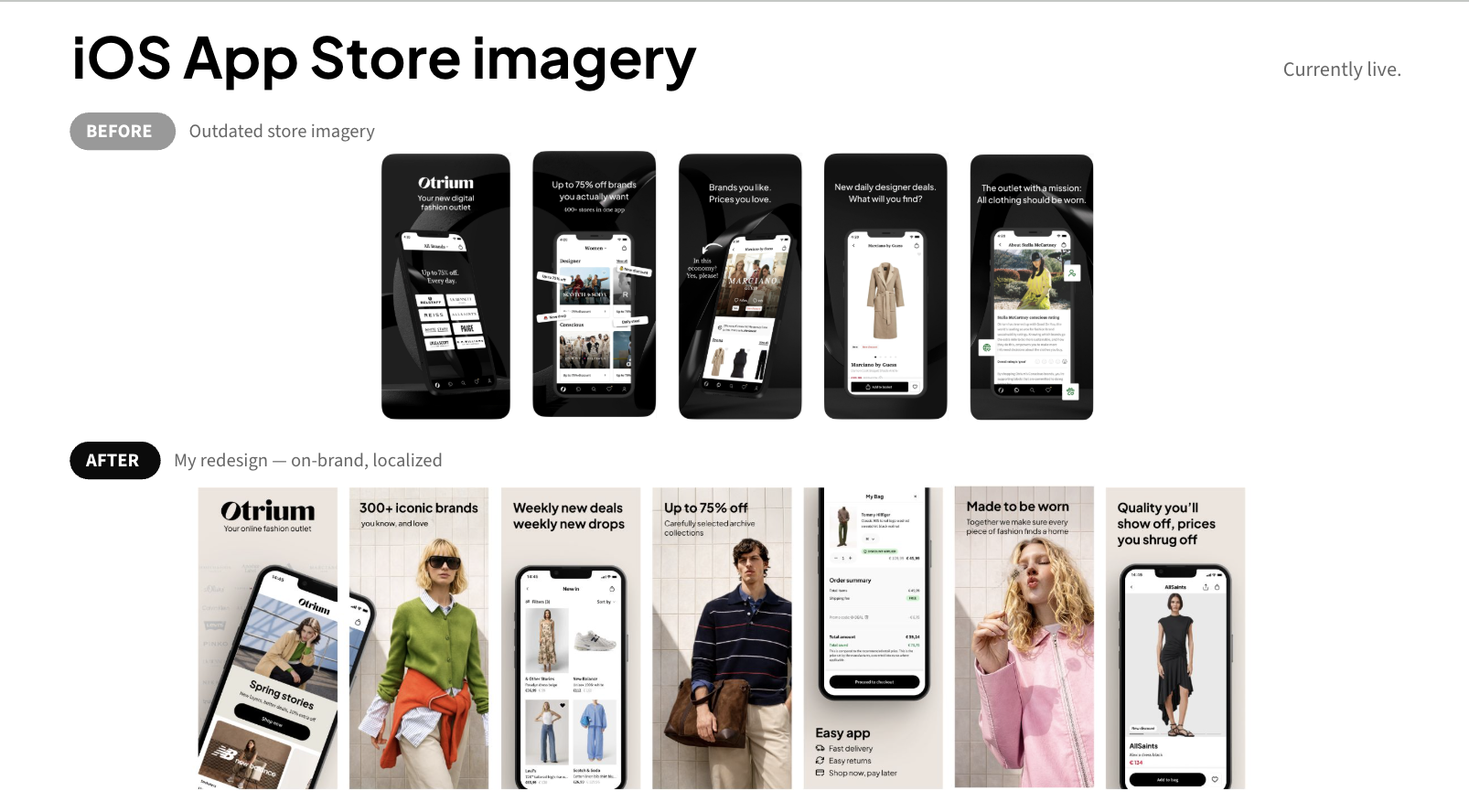
- App Store Assets: Updated the iOS and Android store screenshots to be more visually consistent with the actual app experience.
Measurable Growth.
This project showed how heavily focusing on user data, iterative testing, and a clean UI system can directly impact business growth.
€1.3M
GMV Impact: Annualized revenue impact delivered across optimized funnels.
+28.4%
Total Lift: Total conversion uplift across verified Coframe experiments.
Excellent
Final Grade: Graduated with top assessment from Otrium leadership for independent execution.
Team Feedback
Beyond the quantitative data, shipping these features successfully relied heavily on cross-functional alignment. I was incredibly grateful to receive such positive feedback and public LinkedIn recommendations from product and engineering leadership upon wrapping up these tracks.
"Ines was a fantastic addition to our product team at Otrium. She supported us on complex projects like the Store Credit journey, where she did a great job managing user research and preparing clean, well-structured design handoffs for B2C engineers. She constantly seeks out feedback, adapts quickly, and really owns her growth as a designer."
Elena Verling, Product Design @ Otrium
"Contributing both technically on design elements but also by being a sharp and thoughtful pair of eyes on many things related to our e-commerce platform... I wouldn't hesitate to recommend her for roles!"
Rob Myers, Director of Product, Technology & Data @ Otrium